Assessing LR system performance
This page shows how LiR can be used to assess the performance of an LR system, in particular discriminatory power and consistency. These metrics are typically used to judge whether an LR system is good enough for use in casework, or to find the best LR system among several candidates.
Note: in literature, the term ‘calibration’ is sometimes used to refer to whether an LR system is ‘well-calibrated’ or ‘consistent’. Here, we reserve calibration for the process, while we use ‘consistency’ for the quality of the LLRs.
Metrics
A widely used metric of performance is Cllr, which measures both discrimination and consistency. Other metrics may have practical use as well. See the table below for a list of metrics.
Metric |
Assessment of |
Implementation |
|---|---|---|
log likelihood ratio cost |
discrimination and consistency |
|
minimized cllr |
discrimination |
|
calibration loss |
consistency |
|
rate of misleading evidence |
mostly consistency |
|
devPAV |
consistency |
|
expected LR for both hypotheses |
discrimination |
By definition, the log likelihood ratio cost cllr() equals cllr_min() + cllr_cal().
Visualizations
While a one-dimensional metric is often useful, visualizations give more insight in the behavior of the LR system. Examples of visualizations are:
an
LR histogram, for assessment of discriminationA visualization of the Pool Adjacent Violators (
PAV) transformation, for assessment of consistencyEmpirical Cross-Entropy (
ECE)a
Tippettplot
The PAV transformation is particularly useful to inspect a system (or a set of LLRs, actually) for consistency. It optimizes a set of LLRs (for which the ground truth is known) for consistency without changing the order of the LLRs. The corresponding visualization shows a scatter plot of the original, “pre-calibrated” LLRs versus the “post-calibrated” LLRs, after transformation.
How to read a PAV plot? The example below shows how to interpret the different sections of the plot.
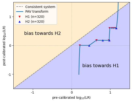
LLRs that are on the diagonal remained unchanged and appear to be well-calibrated. Ideally, all LLRs are somewhere near the diagonal. In that case, the calibration loss will be close to 0.
LLRs that appear above the diagonal are increased after optimization, and the original LLRs were therefore biased towards H2.
LLRs thet appear below the diagonal are decreased after optimization, and the original LLRs were therefore biased towards H1.
Another way to look at it, is to distinguish between overestimated and underestimated LLRs.
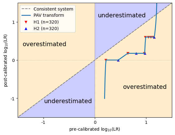
Positive LLRs that appear above the diagonal, and negative LLRs that appear below the diagonal, became stronger after optimization (i.e. further away from 0), and the original LLRs were therefore underestimated.
Positive LLRs that appear below the diagonal, and negative LLRs that appear above the diagonal, became weaker after optimization (i.e. closer to 0), and the original LLRs were therefore overestimated.
In any case, bias and overestimation does not say anything about the ground truth of individual instances. In a particular dataset, LLRs of 3 can be underestimated, but that doesn’t mean that there cannot be an instance with LLR=3 whose ground truth is H2!
Appearance plots and metrics
Let’s see how these metrics and visualizations behave on different types of data.
Neutral LLRs
First, non-informative data, where all LLRs are zero (i.e. neutral). These data are not discriminative, but perfectly consistent!
import numpy as np
import matplotlib.pyplot as plt
from lir.data.models import LLRData
from lir.metrics import cllr, cllr_min, cllr_cal
from lir.algorithms.devpav import devpav
from lir.plotting import lr_histogram, pav, tippett
from lir.plotting.expected_calibration_error import plot_ece

plt.rcParams.update({'font.size': 9})

def llr_metrics_and_visualizations(llrs: LLRData):
    # print the metrics
    print(f'cllr: {cllr(llrs)}')
    print(f'cllr_min: {cllr_min(llrs)}')
    print(f'cllr_cal: {cllr_cal(llrs)}')
    print(f'devpav: {devpav(llrs)}')

    # initialize the plot
    fig, ((ax_lrhist, ax_pav), (ax_ece, ax_tippett)) = plt.subplots(2, 2)
    fig.set_figwidth(10)

    # create the visualizations
    lr_histogram(ax_lrhist, llrs)
    pav(ax_pav, llrs)
    plot_ece(ax_ece, llrs)
    tippett(ax_tippett, llrs)

    # generate the image
    fig.tight_layout()
    fig.show()

# generate neutral LLRs
llrs = LLRData(features=np.zeros((6, 1)), labels=np.array([0, 0, 0, 1, 1, 1]))

# show results
print('results for neutral (non-informative) LLR values')
llr_metrics_and_visualizations(llrs)
results for neutral (non-informative) LLR values
cllr: 1.0
cllr_min: 1.0
cllr_cal: 0.0
devpav: 0.0
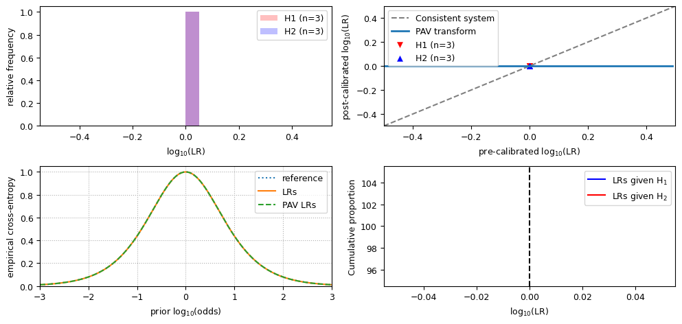
Observe that:
the value for
cllris 1;the value for
cllr_minis 1;the value for
cllr_calis 0;the LR histogram shows a single bar;
in the ECE plot, the LRs line, the reference line and the PAV LRs line are the equivalent;
the PAV plot and the Tippett plot hardly make sense if all LLRs have the same value.
Well-calibrated LLRs
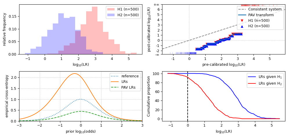
Now, we have LLRs that are both discriminative and consistent, and data of both hypotheses are drawn from a normal distribution. It visualizes as follows.
from lir.algorithms.logistic_regression import LogitCalibrator
from lir.data_strategies import TrainTestSplit
from lir.datasets.synthesized_normal_binary import SynthesizedNormalData, SynthesizedNormalBinaryData

# set the parameters for H1 data and H2 data
h1_data = SynthesizedNormalData(mean=1, std=1, size=1000)
h2_data = SynthesizedNormalData(mean=-1, std=1, size=1000)

# generate the data
instances = SynthesizedNormalBinaryData(h1_data, h2_data, seed=42).get_instances()

# split the data into a 50% training set and a 50% test set
training_instances, test_instances = next(TrainTestSplit(test_size=.5).apply(instances))

# build a simple LR system for these data
calibrator = LogitCalibrator()

# train the system on the training set, and calculate the LLRs for the test set
llrs = calibrator.fit(training_instances).apply(test_instances)

# assess performance
print('results for well-calibrated LLR values')
llr_metrics_and_visualizations(llrs)
results for well-calibrated LLR values
cllr: 0.507989613646022
cllr_min: 0.4814632580758025
cllr_cal: 0.02652635557021954
devpav: 0.1419663980794276

Observe that, for discriminative and well-calibrated LLRs:
the value for
cllris lower than 1;the value for
cllr_minis close tocllr;the value for
cllr_calis close to 0;the LR histogram shows distinct distributions;
in the LR histogram, the peak of the overlap of both distributions is at 0;
the PAV plot approximately follows the diagonal;
in the ECE plot, the LRs line is close to the PAV-LRs line, and the reference line is well above both of them.
Badly calibrated data
LR systems may misbehave in several ways, resulting in inconsistent LLRs. If this happens, check if the training data is suitable for the test data. Inconsistent LLRs can be caused, for example, when the training data are measurements of a different type of glass, when training data are from voice recordings of a microphone versus telephone interception in the test data, or any other kind of mismatch between the training set and the test set.
LLRs may be inconsistent in several ways, including:
bias towards H1, meaning that the LLRs are too big;
bias towards H2, meaning that the LLRs are too small;
overestimation, meaning that the LLRs are too extreme;
underestimation, meaning that the LLRs are too close to 0.
Below are the results of each of such inconsistent sets of LLRs. Let’s have a look at the metrics and visualizations for each of those.
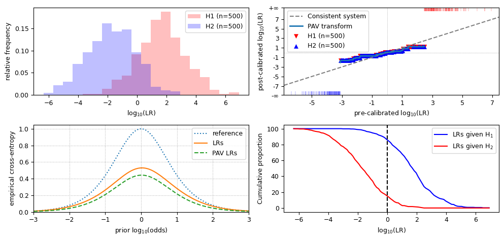
print('all LLR values are *shifted* towards H1')
biased_llrs_towards_h1 = llrs.replace(features=llrs.features + 2)
llr_metrics_and_visualizations(biased_llrs_towards_h1)
all LLR values are *shifted* towards H1
cllr: 2.1162872122187792
cllr_min: 0.4814632580758025
cllr_cal: 1.6348239541429768
devpav: 1.9870093130054092
Observations for LLRs that are biased towards H1:
the value for
cllris increased from well-calibrated data;the value for
cllr_minis the same as in well-calibrated data;the value for
cllr_calis greater than 0;the LR histogram still shows distinct distributions, but they are shifted to the right;
in the LR histogram, the peak of the overlap of both distributions is to the right of 0;
the PAV plot is below the diagonal;
in the ECE plot, the LRs line is evidently above the PAV-LRs line and closer to the reference line (if the LLRs are wildly biased, the LRs line may even be partially above the reference line);
the Tippett plot is shifted to the left.
print('all LLR values are *shifted* towards H2')
biased_llrs_towards_h2 = llrs.replace(features=llrs.features - 2)
llr_metrics_and_visualizations(biased_llrs_towards_h2)
all LLR values are *shifted* towards H2
cllr: 2.0540866303956467
cllr_min: 0.4814632580758025
cllr_cal: 1.5726233723198442
devpav: 2.012990686994589
Observations for LLRs that are biased towards H2:
the value for
cllr,cllr_minandcllr_calare similar to data biased towards H1;the LR histogram still shows distinct distributions, but they are shifted to the left;
in the LR histogram, the peak of the overlap of both distributions is to the right of 0;
the PAV plot is above the diagonal;
in the ECE plot, the LRs line is evidently above the PAV-LRs line, similar to the LLRs shifted towards H1;
the Tippett plot is shifted to the right.
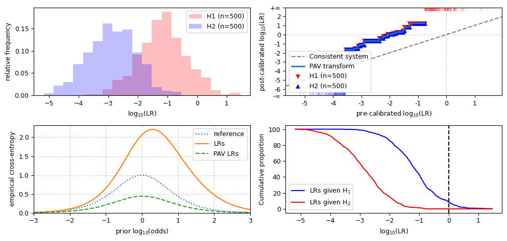
print('the LLRs are *increased* towards the extremes on both sides')
overestimated_llrs = llrs.replace(features=llrs.features * 2)
llr_metrics_and_visualizations(overestimated_llrs)
the LLRs are *increased* towards the extremes on both sides
cllr: 0.5979039293390385
cllr_min: 0.4814632580758025
cllr_cal: 0.11644067126323598
devpav: 0.9506862012236328
Observations for overestimated LLRs:
the value for
cllr,cllr_minandcllr_calare similar to biased data;the LR histogram still shows distinct distributions, but the scale on the X-axis is increased;
the PAV plot is flatter than the diagonal, and crosses it near the origin;
in the ECE plot, the LRs line is slightly further away from the PAV-LRs line, and may cross the reference line near the extremes;
the scale of the Tippett plot is increased.
print('the LLRs are *reduced* towards neutrality')
underestimated_llrs = llrs.replace(features=llrs.features / 2)
llr_metrics_and_visualizations(underestimated_llrs)
the LLRs are *reduced* towards neutrality
cllr: 0.5903548871000373
cllr_min: 0.4814632580758025
cllr_cal: 0.10889162902423477
devpav: 0.5313672102202077
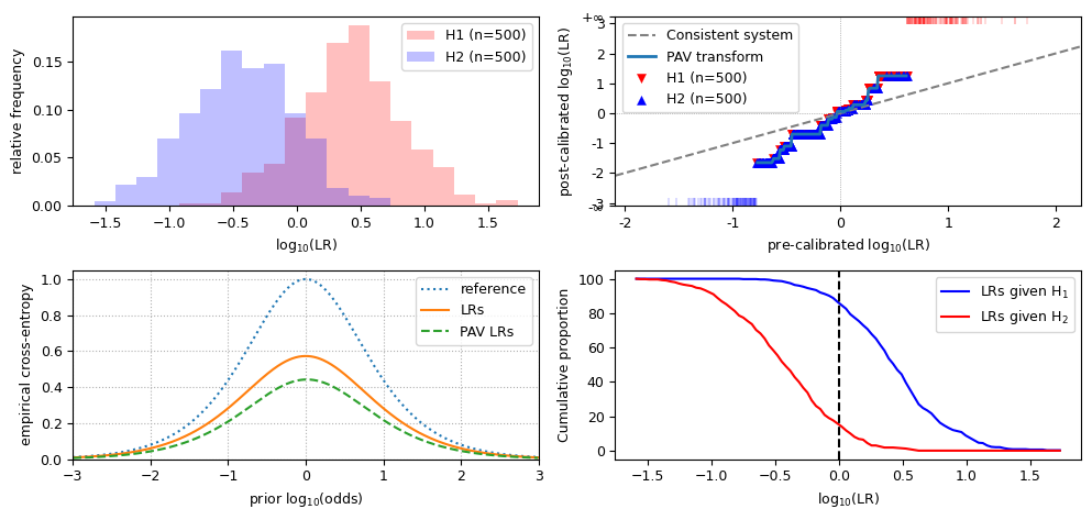
Observations for overestimated LLRs:
the value for
cllr,cllr_minandcllr_calare similar to biased data;the LR histogram still shows distinct distributions, but the scale on the X-axis is increased;
the PAV plot is steeper than the diagonal, and crosses it near the origin;
in the ECE plot, the LRs line is slightly further away from the PAV-LRs line;
the scale of the Tippett plot is decreased.
That’s all for now!